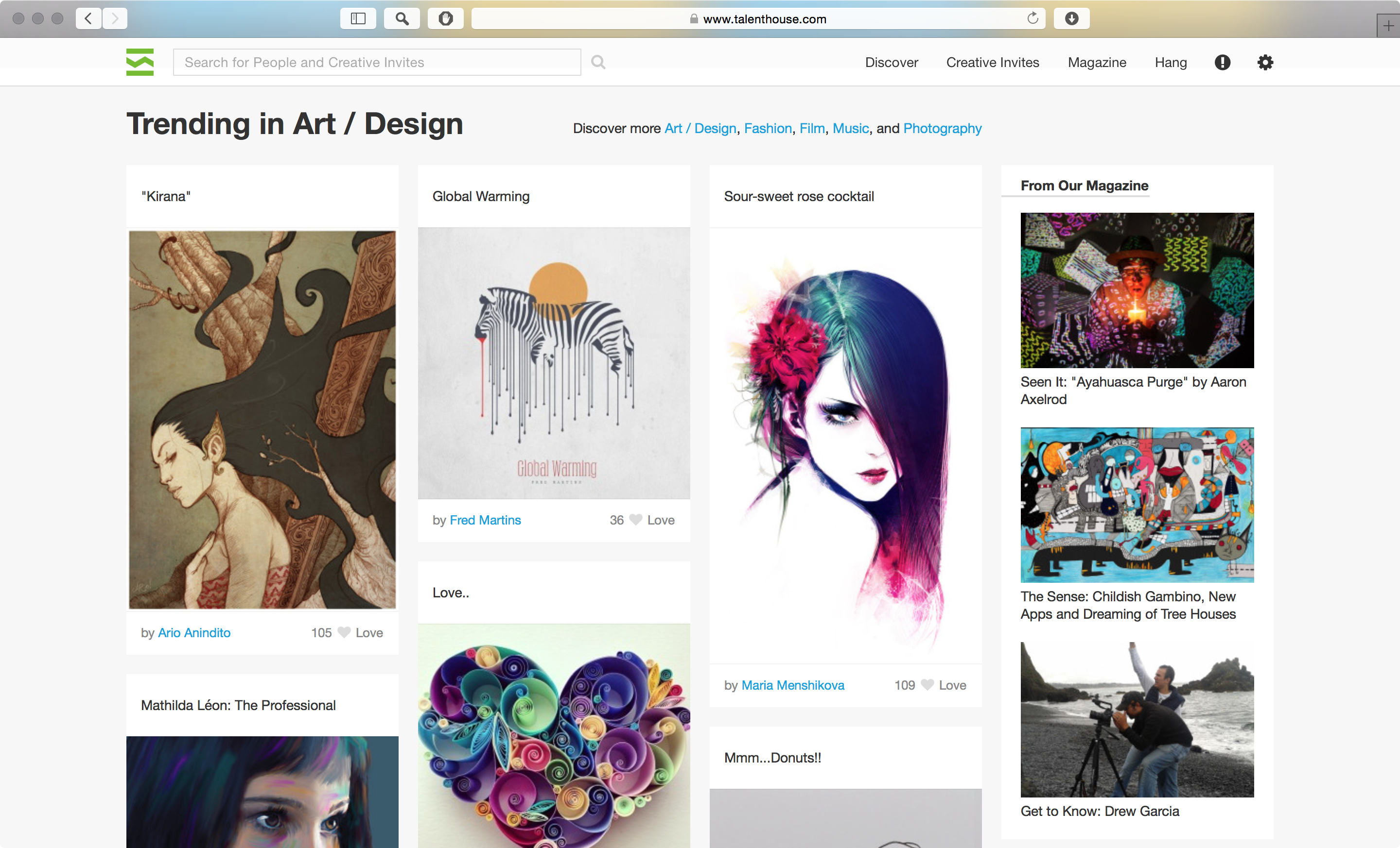
April 2015, this is an update to demonstrate the change of about one year. I continued to work with Talenthouse after the relaunch 2014 which was a complete overhaul of the website. Since then we improved on the interface and there have been a couple of challenges. As the product designer my tasks include finding ways of highlighting new and important (paid) content and making artworks in different formats look good equally, i.e. find solutions for dynamic content. The first design I changed was the one for the discover page (art in an organic grid) – How do you structure it, so it is fluid, but not chaotic? What if a picture has a lot of white? Experimenting with different content is crucial to be prepared for as many cases as possible.
Of course we’re constantly working on improving the experience and the developer team works on new features that have to be designed. So, it’s also important to say that these “reports” are only a capture of a specific moment in the life time of an online product. As of 2018, more than 3 years after leaving talenthouse.com did not change much compared to the designs here.
Home Page
As a logged in user you would see Creative Invites at the top of the home page and below there is trending artwork from your preferred category (in my case Art/Design). The different types of content are separated visually through full width sections with different background colors.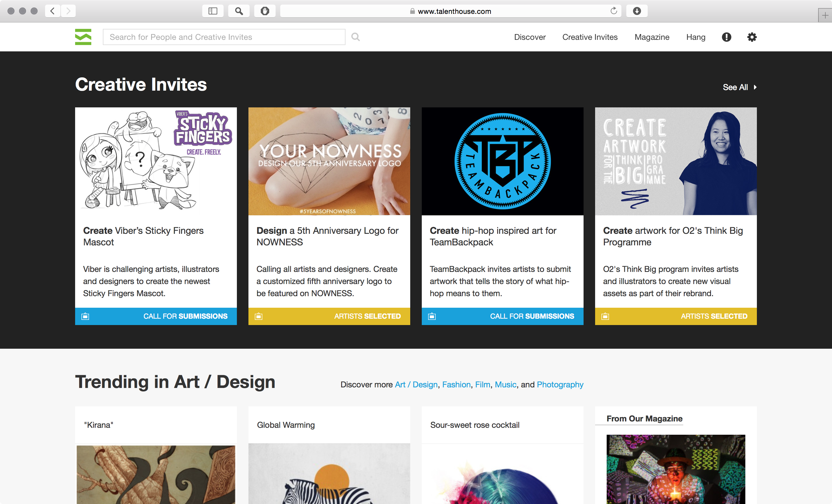
Discover Page
Now, in the same card style. This design language is found throughout the platform. Also the feature to “love” the artwork was added.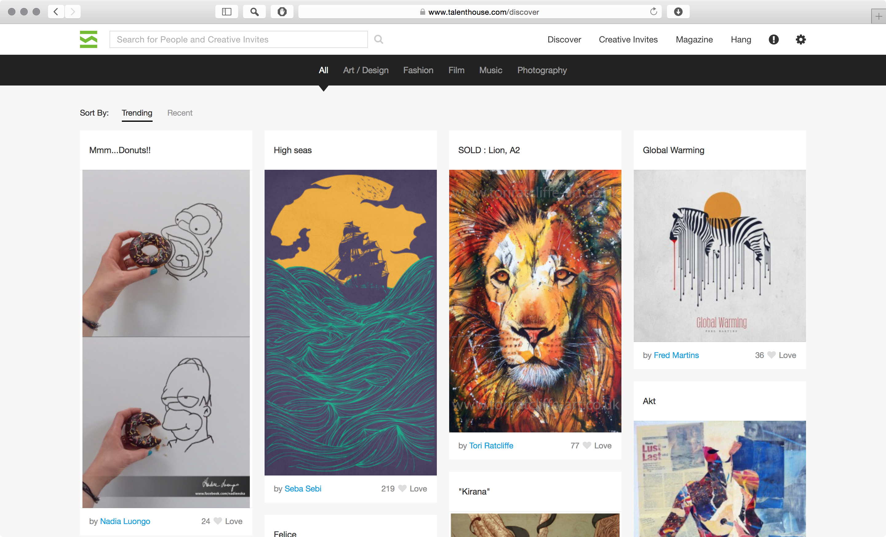
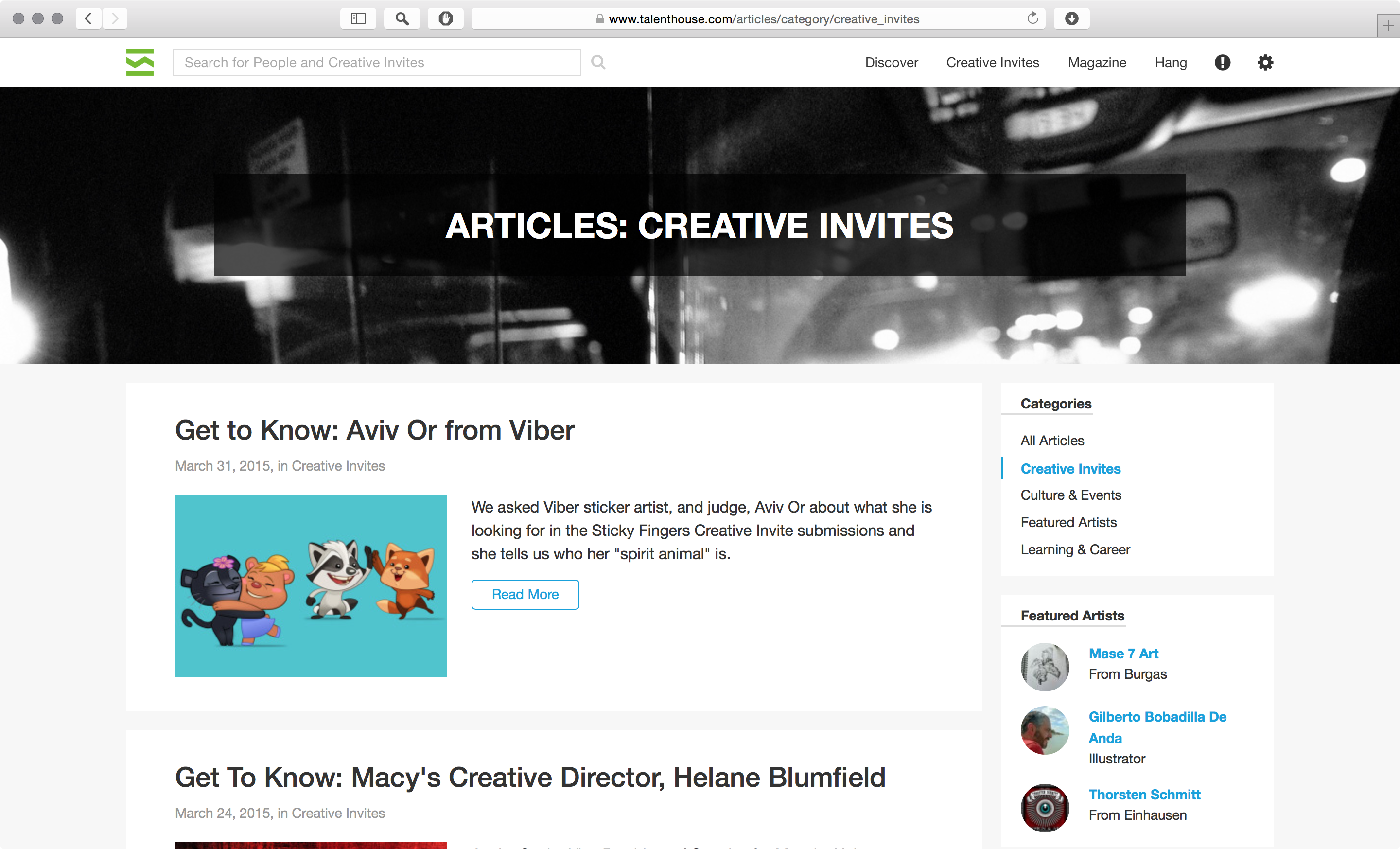
Articles
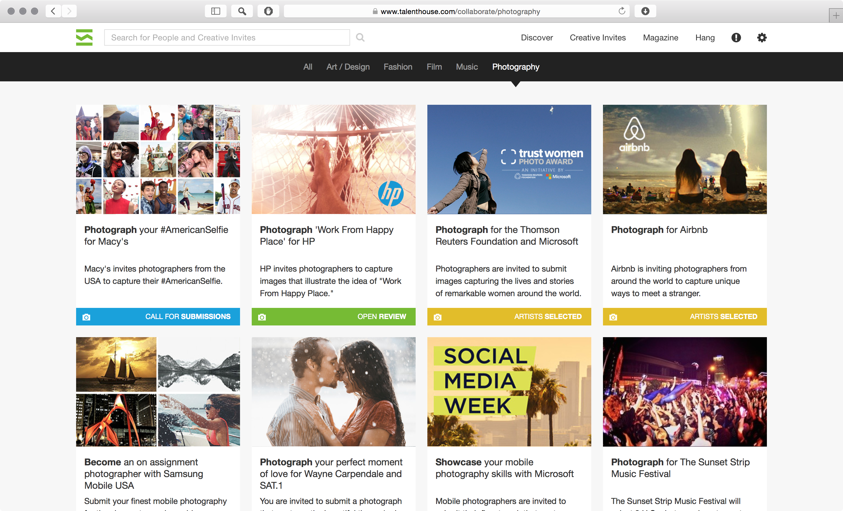
Collaborate Page
This is the page where you can find all the Creative Invites – from different categories and in different stages (e.g. call for submissions or artists selected). I worked a lot with colors and icons to achieve a clear and clean design. As of 2018, you can still see this design in action at www.talenthouse.com/collaborate.
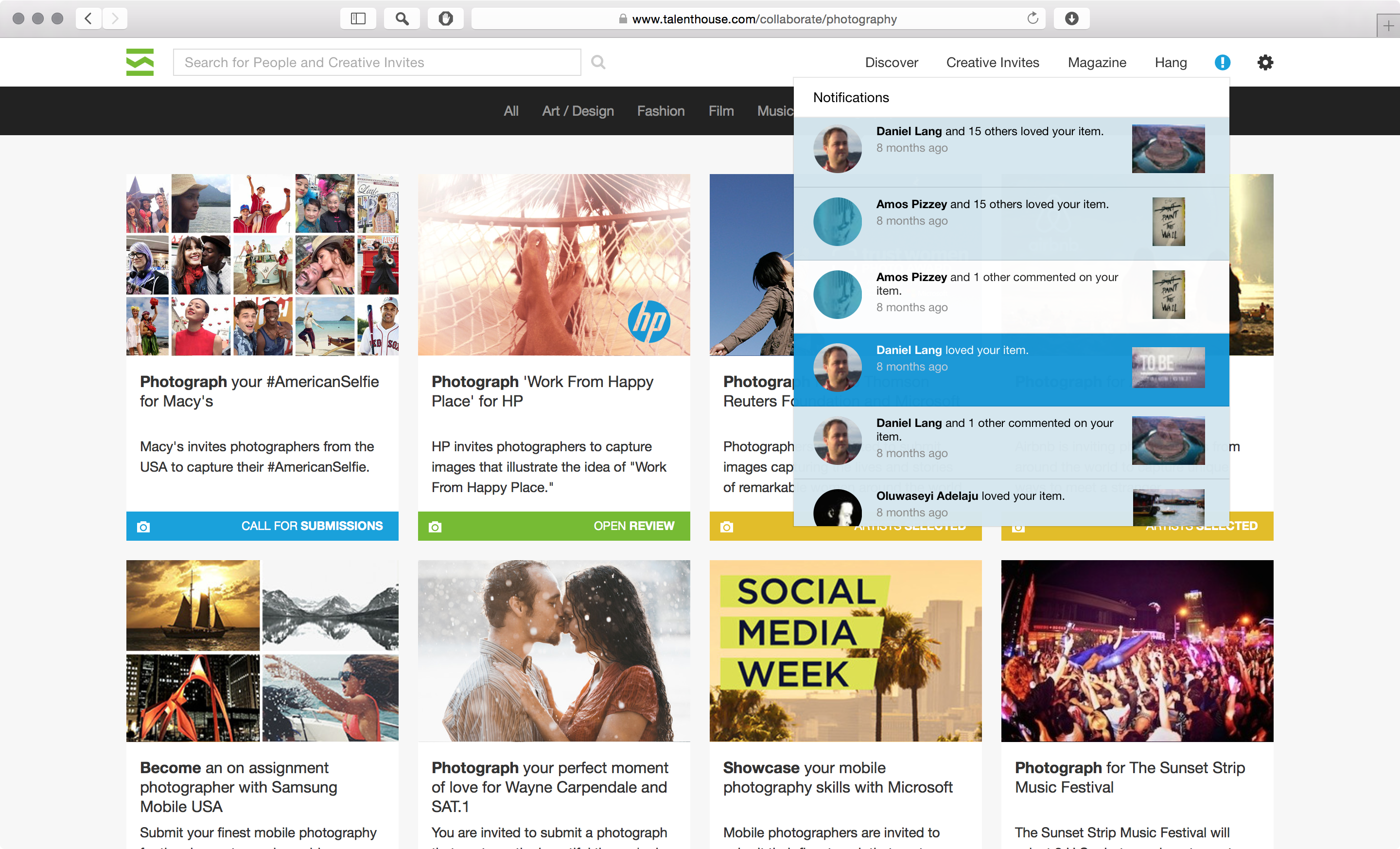
Notifications
Since it’s a creative community, we wanted to encourage the artist to interact with each other and with each other’s work. So, the notifications panel at the top right of the layout had become more important.
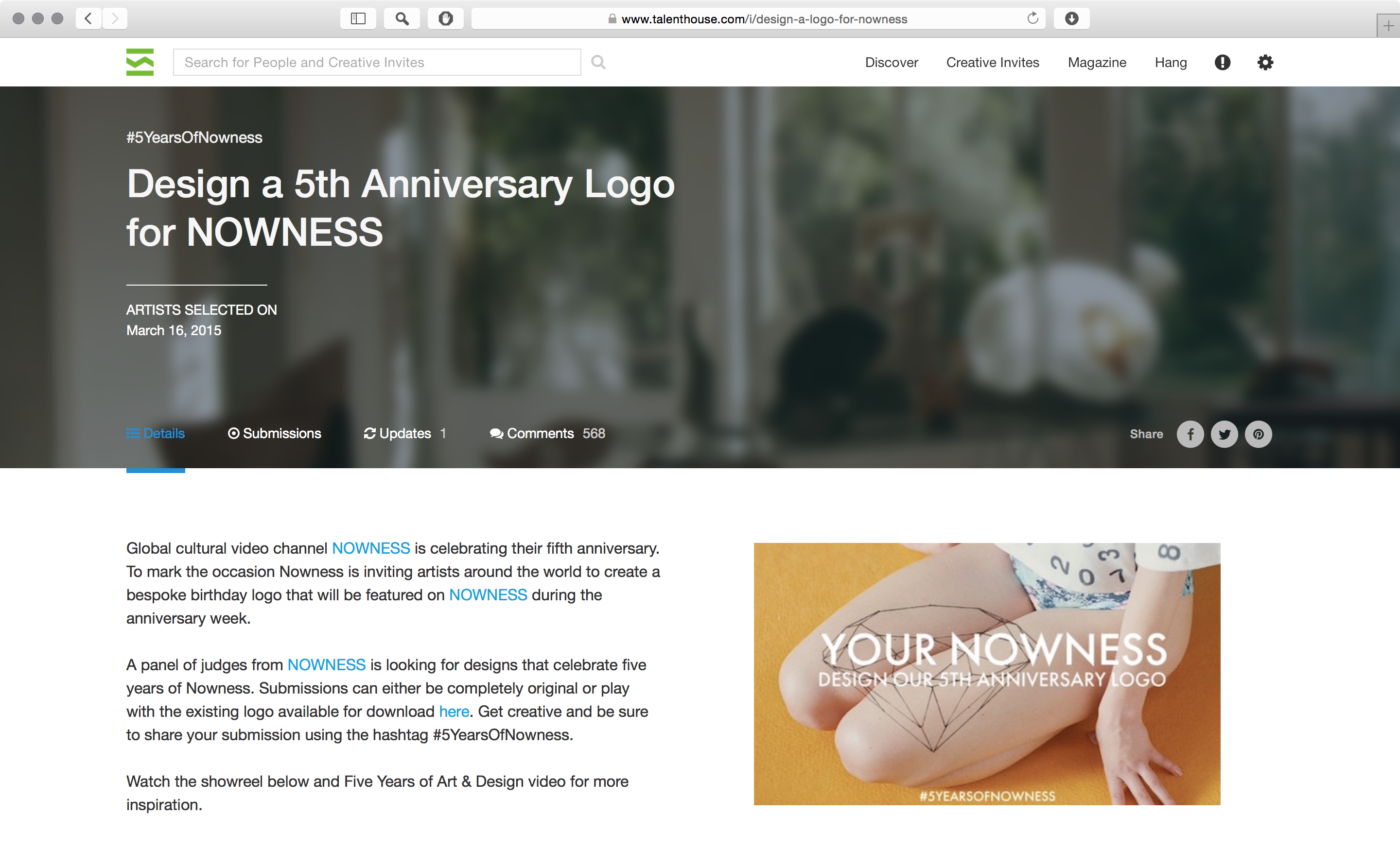
Creative Invite
We also went through a few iterations for the Creative Invite page. It has to be informative and visually inviting, of course. I decided to have a blurred background image. It creates aesthetic appeal, but due to a half transparent black overlay it “stays in the background” making the information visible.
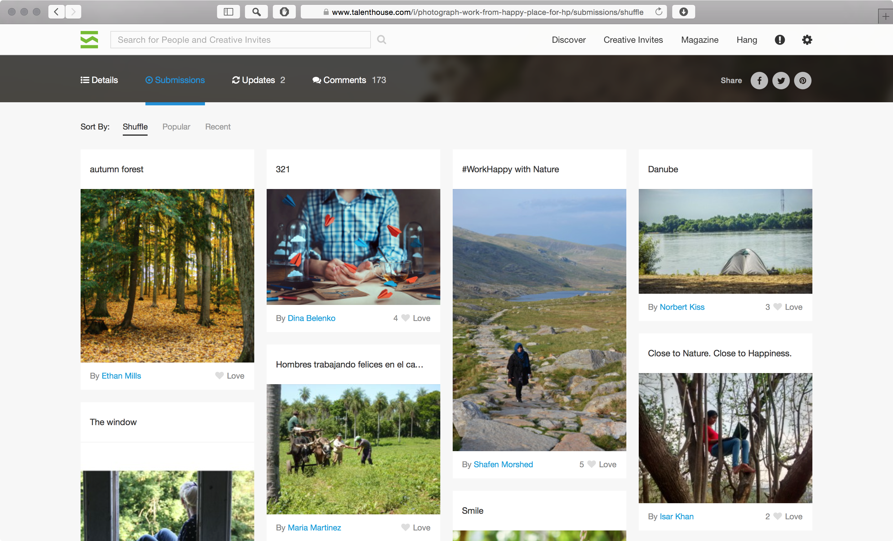
Submissions follow the same organic grid as the Discover page.
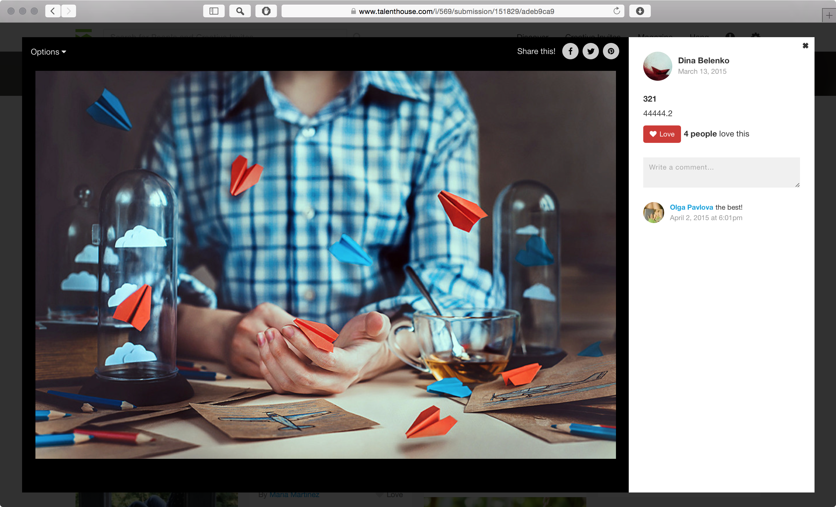
And there is also a unified experience for seeing content fullscreen – no matter if you are on the Discover page, or clicking on a submission to an Creative Invite, or want to comment on art work on someone’s profile.
Profile
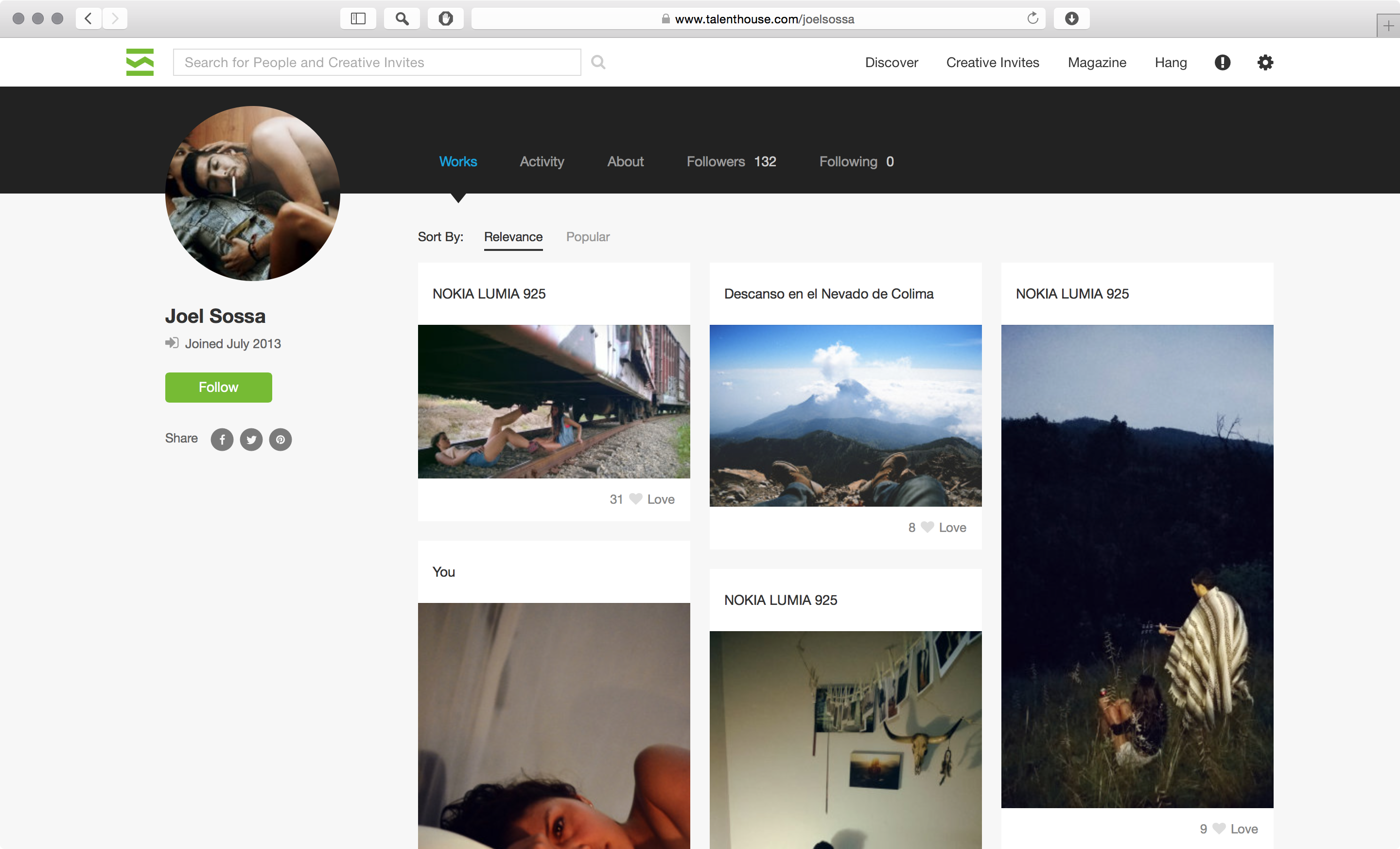
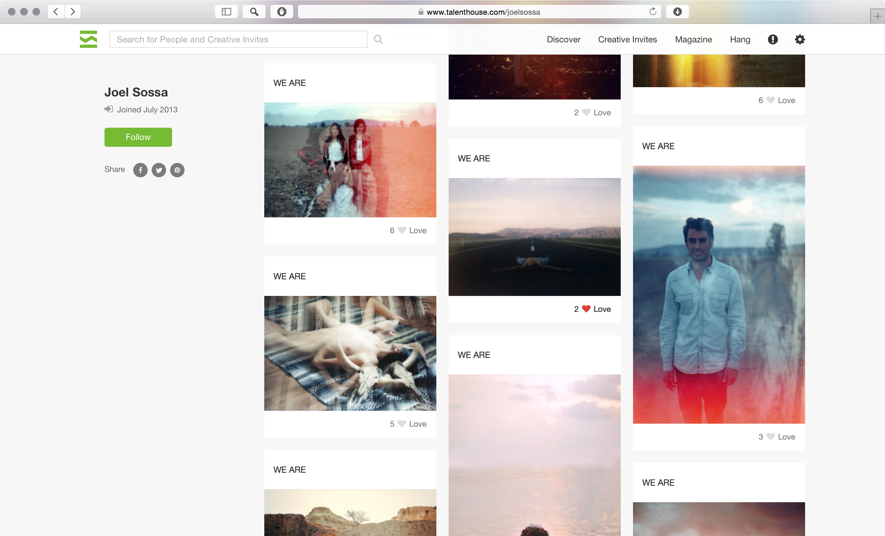
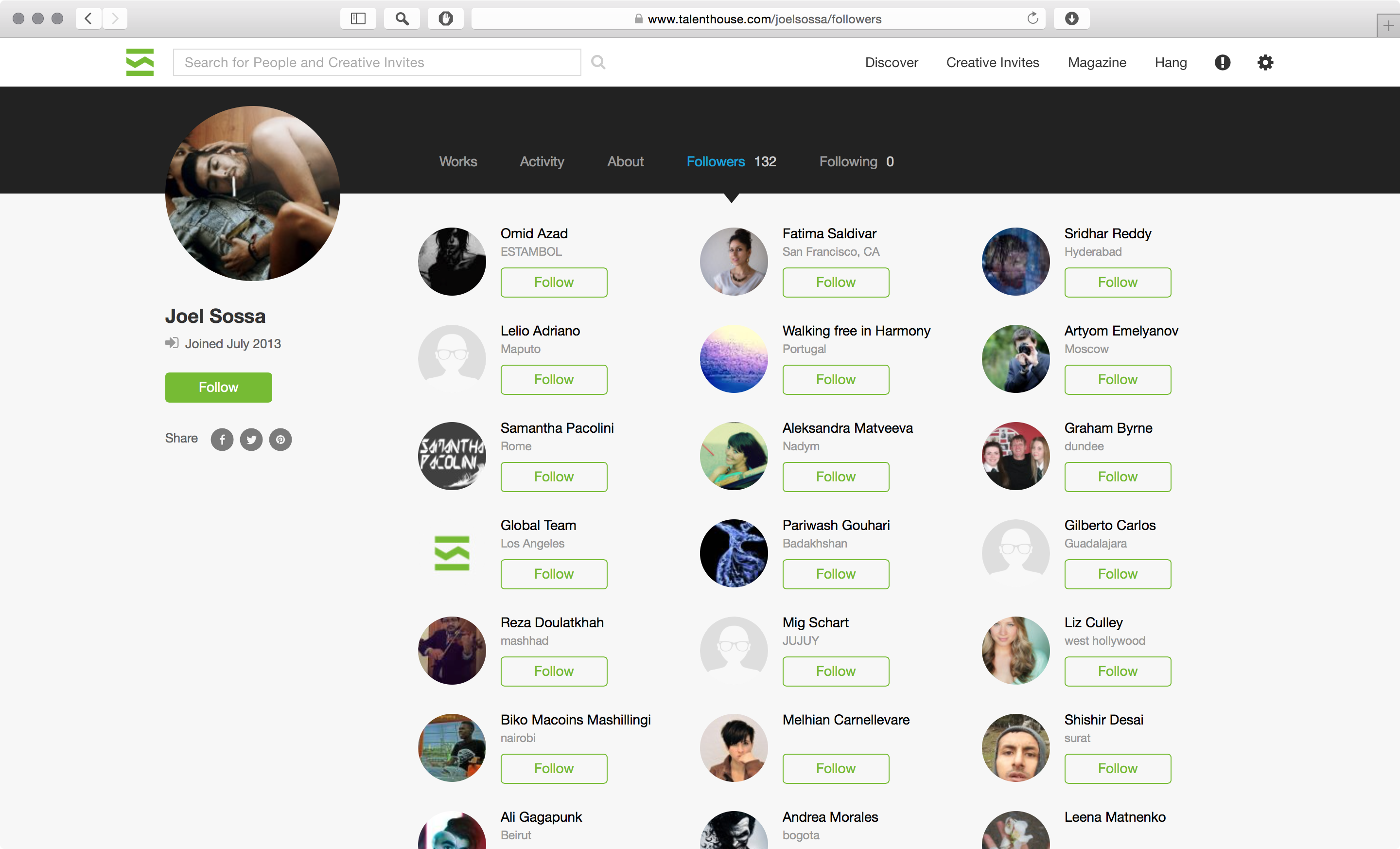
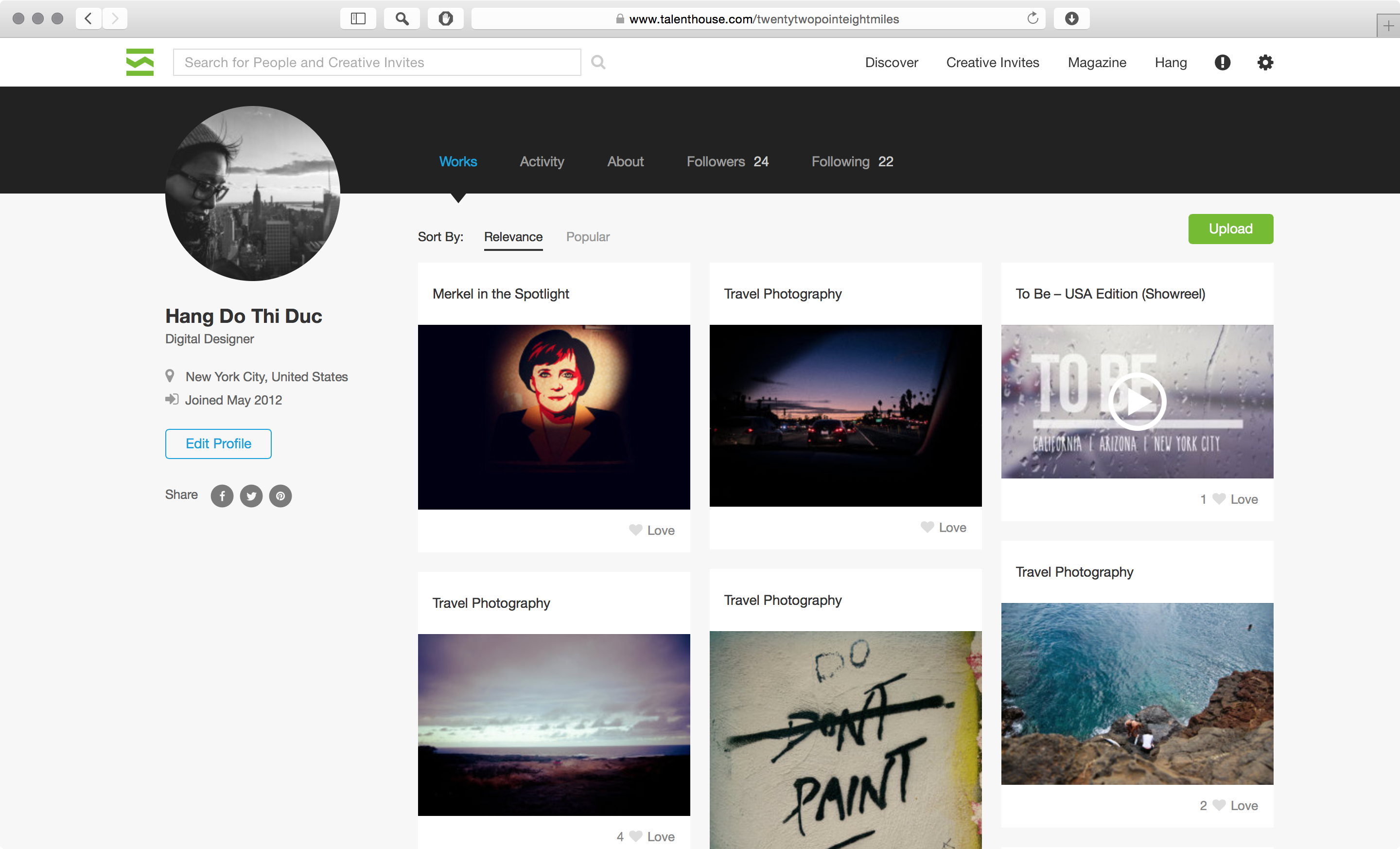
Apart from some minor rearrangements of elements and colors with more contrast the profile has not changes much in the past year.
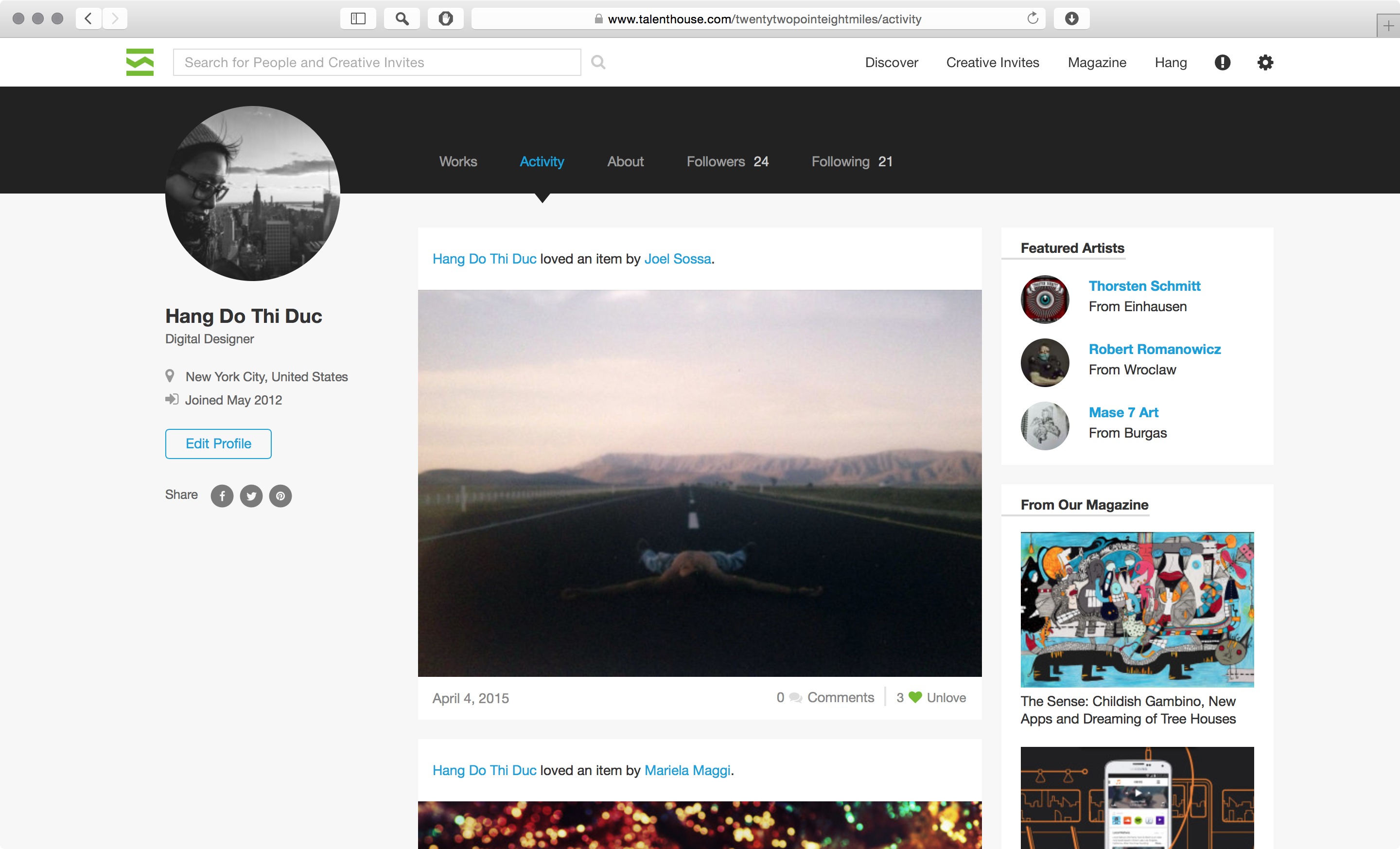
A feature called Activity has been added. It shows a feed the items the profile owner has loved – one can love images and videos anywhere on the Talenthouse platform. In the future there will be more activities displayed.

I had a unique experience with Talenthouse as I had the privilege to redesign this platform from the ground up and to also expand on that in the course of the year. I grew as a designer in this process, learning how to communicate with developers to see my vision executed, sometimes accepting compromises between design and development time.
I delivered the mock-ups in high fidelity jpgs exported from Photoshop. I found this to be best while working with remote developers.